|
Search found 4 matches for 121 | | Author | Message |
|---|
 Topic: Digitally coloring B&W Images. Topic: Digitally coloring B&W Images. | Tymber
Replies: 87
Views: 3248
| Search in: Non EQ Stories/Art  Subject: Digitally coloring B&W Images. Tue Nov 10, 2015 4:10 pm Subject: Digitally coloring B&W Images. Tue Nov 10, 2015 4:10 pm | - Embala wrote:
Yes, I know about Storm's white eyes ... it weird when I get the impression to see right through the head.
Hah! I can see that. I don't know why I never thought of that. I guess because when I first began reading comics, Uncanny X-Men #121 and Avengers #66 - and they were my first comics! So I was just used to Storm missing pupils! (I guess you get used to it, when there's a member on the team who shoots red beams out of his eyes {Cyclops}, a blue looking elf with three fingers and toes, and a tail {Nightcrawler}, and a big, furry orange guy {Sasquatch}) - someone with white eyes just didn't seem unusual to me! LOL - Embala wrote:
Well, Elfquest is almost too familiar for me. I have a very clear imagination how colors must look ... and no matter how differrent coloring turned out during the years I have a nostalgic preference for the colors I've seen first. Therefore my first reaction was to point out "wrong" colors. Then I took a second and third look... reconsidered ... and noticed two things:
- Your coloring has it's own appeal and is mostly within the range of the usual color variation.
- You might have nostalgic preferences just like me ... but for a different edition because ...
They're the wrong colors, no need to reconsider.  I am not able to match exactly the correct colors. I try to get as close as I can, without bleeding out the black lines of the art (and sometimes that means using a much lighter hue of color, for example, Cutter's hair is one). Otherwise, I would then need to retrace the image lines on top of the coloring job (which would be a pain... but not entirely impossible!) - Embala wrote:
   - ... your coloring reminds me of the Marvel issues! I'm not too familiar with them but that's how I remember them. The Wolfrider skin tone works well. Leetah's skin is different from the warm brown I prefer but a good match. Careful coloring of delicate eyebrows and lips. I have a hard time to get used to BLACK hair for Leetah, tho ... don't buy it. Another detail that feels wrong is the chiefs knot - it shouldn't look like locks. The warmer hue of Cutter's golden neckring is a good and >I love the warm glow of Leetah's hair adornement ... like it reflects the sunset. - ... your coloring reminds me of the Marvel issues! I'm not too familiar with them but that's how I remember them. The Wolfrider skin tone works well. Leetah's skin is different from the warm brown I prefer but a good match. Careful coloring of delicate eyebrows and lips. I have a hard time to get used to BLACK hair for Leetah, tho ... don't buy it. Another detail that feels wrong is the chiefs knot - it shouldn't look like locks. The warmer hue of Cutter's golden neckring is a good and >I love the warm glow of Leetah's hair adornement ... like it reflects the sunset.
The trick of making Leetah's color "black" with hues of blue, is indeed to show a dark colored hair. I should have made it reddish; but it kind of bled out her headband when I did that. So I just went with a darker color. - Embala wrote:
One criticism - when you color parts that are supoosed to be shiny, especially metal, so your best to spare the black parts! when they are overlayed with color it dims the contrasts down and takes aways the shinyness.
This time the chiefs knot is correct in brown ^^ ... I like how it matches the cord of the loadstone.
Good note about the shiny metal. - Embala wrote:
It must have been challenging to color a drowing with such soft, sketchy lines. Well done, Tymber.  It's all done with layers. What I do is take a transparent layer over the B&W image, and color it. Then use the layer properties to lighten the layer so it overlaps and shows the B&W image lines. So it's a lot of mixing and matching after I have the initial colors, to try and get as close as I can to the "correct" colors. | | Topic: Digitally coloring B&W Images. | Tymber
Replies: 87
Views: 3248
| Search in: Non EQ Stories/Art Subject: Digitally coloring B&W Images. Mon Nov 09, 2015 5:10 pm | - Embala wrote:
Oh, I feel free!  First you should know that Marvel X-Men/Alphsa Flight are mostly unknow territory for me. I barely know part of the characters. First you should know that Marvel X-Men/Alphsa Flight are mostly unknow territory for me. I barely know part of the characters.
Thank you. It's an odd feeling to post something and then get no response... it feels like no one cares. Even a "Hey, those are good/bad!" is better than nothing! - Embala wrote:
First Post ...
Dark Phoenix vs the X-Men - I like the way you gave the phoenix life in shades of orange and the contrast of the dark grey ground. Like burnt soil ... ashes.
Probably one of my favorite ones, because there's so much color throughout the photo. And I indeed made the general background (and the ground itself) a darker color to pop the other colors more. - Embala wrote:
Alpha Flight - Sasquatch sticks out. The brown colored lines make his pelt look fluffy - pettable. ^^
Another Alpha Flight - Once again Sasquatch comes to live with the colored lines! The technique works great with the water fountain as well. Vindicator's aura and Snowbird's wings turn out flat in comparism. The P-Guy brims glows in vibrant blue!
Sasquatch does tend to stick out; being as big as he is and the color! - Embala wrote:
Second post ...
Uncanny X-Men vs Juggernaut - a dark violent scene. Plain colors make good contrasts. The dark grey walls emphasize the terror! "Bat-Ears" somehow lost shape and substance in the coloring process while "Demon" got an impressive dark glow.
LOL! Bat-Ears! I love you right now. Yeah, I totally messed up Wolverine, and was just done editing it so I moved on and left it. - Embala wrote:
Another Alpha Flight - a variant coloring from the first post. It's lively and I like Vindicator's vibrant red. In general I prefer the paler colors from the first post ... they seem to fit better with the lineart for me.
Makes sense! - Embala wrote:
Defenders 133 - The colored lines work well for Valkyrie's hair. Her body and Angel-Guy turned out "sloppy" in my eyes - colors that crossed outlines or simply covered detail lines (i.e. in the belt) so that it looks flat. Garboyle and the pier are fine! sTrong contrasts the one, blurred greasy surface the other.
Another one of the Defenders - all nice and clean. Valkyrie's skin and lips hahave a believable hue and I like how Beast's color wants to melt with the darkness.
Gargoyle is my favorite in that photo; he turned out very close to his comic book color. - Embala wrote:
ROM - Let's just say the colors work! the contrast of the green and red is fab - colliding colors mimic the collision of forces.
Thank you! ROM is difficult because he is technically just white. So I try to make him an off white color, so that there's a little more to him. - Embala wrote:
- Fifth post:
funkafied coolness - I have no idea who those "exotic" guys are but they looks cool indeed ... as does the coloring.
From the game Toejam & Earl (originally on the SEGA system, then later the third one was on the original XBOX system). The kickstarter for the newest game was joyfully funded! - Embala wrote:
Uncanny X-Men 121 - all the figures and colors look fine, clear and distinct. The colored background brings out the colors even better, especially as many characters hve white in their color scheme.
I thought so too. That's why in some, I will just color the background ONE color to make the rest of the image stick out. - Embala wrote:
UXM #121 - nice to get an idea of the original b/w page and see the developement. Well, EQ and Wendy taught me to appreciat good b/w comics but I'm still a color freak. I need this visual help to get the scenes to full extend.
Same, all the comics for these are colored in comics. But naturally, they're all B&W before they're colored by the comic company. So I take the B&W images and try to color them myself (it helps me relax... in that regard I am like a 5th Grader in school). - Embala wrote:
Seventh post:
The golden-black contrast works great. Armbands turned out almost shiny and the greyish reflections give the outfit a silken touch.
I don't buy eyes an teeth. Well, I know Storm is supposed to have pale white eyes but in this coloring I get the impression to see right through the head on the background. It might help to simply color the background. I'd suggest to break the white "holes" with some grey, tho. A fine irregular line that parts the wall of teeth and some misty reflection in the eyes could give the face more life.
The skin tone looks warm against the golden metal and is enhanced by the warm red glow of the jewel.
So the thing with Storm, is she's typically seen without pupils (just the whites of her eyes). http://www.blastr.com/sites/blastr/files/X-Men-Byrne.pngBut then other times, she has thin slits (almost like a cat) http://2.bp.blogspot.com/-gbdb1U4WR-E/UphZWKswAsI/AAAAAAAATOY/ZUARQShAdL4/s1600/x6+001.jpg - Embala wrote:
btw: one or two of the pictures are so big that they "break" my screen. Hard to read text in crazy long lines while I need to scroll back and forth. Maybe you can resize the biggest ones before posting next time? Will keep that in mind! My apologies! | | Topic: Digitally coloring B&W Images. | Embala
Replies: 87
Views: 3248
| Search in: Non EQ Stories/Art Subject: Digitally coloring B&W Images. Sun Nov 08, 2015 11:12 pm | Fifth post: funkafied coolness - I have no idea who those "exotic" guys are but they looks cool indeed ... as does the coloring. Uncanny X-Men 121 - all the figures and colors look fine, clear and distinct. The colored background brings out the colors even better, especially as many characters hve white in their color scheme. Sixth post: Jean Grey - the variation in green is somehow livelier ... as if the character returns to life. And it matches her eyes. I like both - each hcoloring has it's own appeal. UXM #121 - nice to get an idea of the original b/w page and see the developement. Well, EQ and Wendy taught me to appreciat good b/w comics but I'm still a color freak. I need this visual help to get the scenes to full extend. Seventh post: The golden-black contrast works great. Armbands turned out almost shiny and the greyish reflections give the outfit a silken touch. I don't buy eyes an teeth. Well, I know Storm is supposed to have pale white eyes but in this coloring I get the impression to see right through the head on the background. It might help to simply color the background. I'd suggest to break the white "holes" with some grey, tho. A fine irregular line that parts the wall of teeth and some misty reflection in the eyes could give the face more life. The skin tone looks warm against the golden metal and is enhanced by the warm red glow of the jewel. Couldn't resist a fast try: 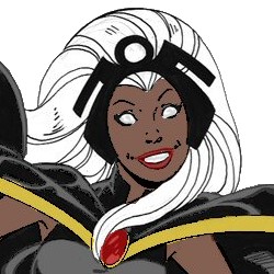 EDIT: (No, I have NOT overseen anything. ... it's high time for bed.) btw: one or two of the pictures are so big that they "break" my screen. Hard to read text in crazy long lines while I need to scroll back and forth. Maybe you can resize the biggest ones before posting next time? | | Topic: Digitally coloring B&W Images. | Tymber
Replies: 87
Views: 3248
| Search in: Non EQ Stories/Art Subject: Digitally coloring B&W Images. Thu Oct 29, 2015 12:06 pm | Here's the Jean Grey picture of the aforementioned Dark Phoenix version:  To show some of the steps of me recoloring the UXM #121 page:  | | |
| | Latest topics | » Who am I - gameToday at 2:50 am by Redhead Ember » Happy Birthday, Prayer! (aka Fairyring)Wed May 15, 2024 5:23 pm by Yeee » Happy Birthday to Multimedea!Tue May 14, 2024 4:22 am by Leanan » Happy Birthday, LurkingCat!Tue May 14, 2024 4:22 am by Leanan » Guesssss whooooooo'ssssssTue May 14, 2024 4:22 am by Leanan » Redhead Plays with Emoticons - Contains SpoilersSun May 12, 2024 6:45 am by Redhead Ember » Yeee`s sketchbookSat May 11, 2024 4:58 pm by Yeee » Let's Ride! Elfwest is backFri May 10, 2024 9:39 pm by Wiseshaman» It`s Mermay again!Fri May 10, 2024 8:57 pm by Tynami » How's your day going?Thu May 09, 2024 5:12 pm by Rainflower » Redlance: A Treeshaper, nothing more and nothing lessSun May 05, 2024 9:32 am by Wiseshaman» Happy Birthday to TrollHammer!Fri May 03, 2024 2:40 am by TrollHammer » Happy Birthday to DreamcatTue Apr 30, 2024 10:11 am by jaRf » Happy Birthday, Manga!Tue Apr 30, 2024 10:11 am by jaRf » It's Smoketreader's Birthday!Sun Apr 28, 2024 12:21 pm by Leanan » Shaman's Shogun AUSun Apr 28, 2024 10:09 am by Wiseshaman» Elfquest Dolling Thread 3Thu Apr 25, 2024 7:56 am by Leanan » AI Personal Characters and ArtworkTue Apr 23, 2024 10:14 am by Tynami » Ban the person above you.Sun Apr 21, 2024 11:23 am by Leanan » ITS KINNYS BIRTHDAYSat Apr 20, 2024 4:37 am by Stormcatcher » It's Redhead Embers Birthday!Sat Apr 20, 2024 4:26 am by Stormcatcher » UPLOADED ELEMENTSSat Apr 20, 2024 4:22 am by Stormcatcher » Trollbabe's TalesFri Apr 19, 2024 8:17 pm by Trollbabe » Happy Birthday katcombs!Wed Apr 17, 2024 7:50 am by Yeee » thetrappedartist has birthday today!Wed Apr 17, 2024 7:16 am by Leanan » Happy Birthday, Sofia!Wed Apr 17, 2024 7:16 am by Leanan » What have you discovered today?Sat Apr 13, 2024 9:33 am by Tynami » Analysis of Wendy's Elfquest artSun Apr 07, 2024 1:39 pm by Prism » Welcoming a new cub!Tue Apr 02, 2024 11:02 am by wolfmoonsky » Happy Birthday to Wildfire!Mon Apr 01, 2024 6:52 am by Leanan |
| Disclaimer | Elfquest art copyright Warp Graphics, Inc. Elfquest, its logos, characters, situations, all related distinctions, and their distinctive likenesses are trademarks of Warp Graphics, Inc. All rights reserved. www.elfquest.com/ To read Elfquest, click the following:READ ELFQUEST ONLINE
|
|